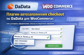
The standard WooCommerce checkout page is one long form with dozens of fields. The customer sees it all at once, right from the first screen, and immediately understands how much they need to fill out. For many, this is enough reason to close the tab.
The multi-step checkout solves this problem by breaking the process into several short steps, each simple and clear. In this article, we’ll explain how it works, who it’s suitable for, and what really changes after implementation.
- What is a Multi-step Checkout
- Why Multi-step Checkout is Better Than Standard
- Psychologically Easier to Start
- Fewer Errors
- More Convenient on Mobile
- Easier to Add Logic for Different Customers
- Who Especially Needs a Multi-step Checkout
- How Multi-step Checkout Affects Conversion
- What to Consider When Implementing
- Progress Indicator
- Ability to Go Back
- Data Persistence Between Steps
- Final Block with Total Amount
- Loading Speed
- Plugin or Custom Development
- Conclusion
What is a Multi-step Checkout
A multi-step checkout is an order process divided into sequential screens. Instead of one large form, the customer sees several small ones, each dedicated to a single task.
A typical structure looks like this:
Step 1 — Contact Information. Name, phone, email. Three or four fields, filled out in 30 seconds.
Step 2 — Shipping Address. City, street, house, apartment. If autofill is enabled, the customer often doesn’t have to enter most of this manually.
Step 3 — Delivery Method. Courier, pickup point, self-pickup. The customer chooses a convenient option and sees the cost.
Step 4 — Payment. Card, cash, invoice for legal entities. The total amount including delivery is shown here.
Each step is a single decision. There’s no need to keep the entire form in mind at once.
Why Multi-step Checkout is Better Than Standard
Psychologically Easier to Start
A long form can feel overwhelming even before the customer starts filling it out. A short first step — name and phone — doesn’t scare them. Once started, the effect of incomplete action kicks in: they’ve begun, so it’s a shame to quit.
Fewer Errors
When the customer focuses on one group of fields at a time, they make fewer typos and miss fewer required fields. Any error is immediately noticeable on the specific step, not buried in a long list at the end.
More Convenient on Mobile
On a smartphone, a long form means constant scrolling and risk of losing focus. A short screen with three fields fits entirely, so the customer sees everything they need to fill out right now.
Easier to Add Logic for Different Customers
A multi-step checkout is easier to adapt: show or hide steps depending on the customer type, chosen delivery method, or other conditions. For example, if the customer chooses self-pickup, the shipping address step is skipped automatically.
Who Especially Needs a Multi-step Checkout
Stores with a broad audience. If your customers include older people or those who rarely shop online, a simplified form is critically important.
Stores with mobile traffic of 50% or more. If more than half of orders come from phones, the standard WooCommerce checkout is clearly not optimal.
Stores working with legal entities. When company details need to be collected, the form gets longer. Breaking it into steps makes it less intimidating.
Stores with multiple delivery methods. If you have courier, pickup points, and self-pickup, it’s more convenient to first ask for contacts and address, then offer suitable delivery options with current costs.
Stores with a high cart abandonment rate. If analytics show customers leave specifically on the checkout page, it’s the first candidate for redesign.
How Multi-step Checkout Affects Conversion
Exact numbers depend on niche, audience, and how poor the original checkout was. But the general pattern is consistent: simplifying the checkout form reduces cart abandonment rates.
From WooCommerce store implementation experience:
— Customers leave the checkout page less often because the first step looks simple and isn’t intimidating in size.
— Fewer errors in orders because each step is validated separately, not all at once at the end.
— Managers spend less time clarifying details because the form collects information in a structured way.
One client, owner of an electronics online store, after implementing a custom multi-step checkout with DaData autofill, noted a noticeable increase in conversion and almost complete elimination of address errors — previously, managers manually corrected a significant portion of orders.
What to Consider When Implementing
Progress Indicator
The customer should understand which step they are on and how many remain. “Step 2 of 4” or a visual progress bar reduces anxiety and prevents drop-offs.
Ability to Go Back
The customer should be able to return to the previous step and correct data without losing what’s already been entered.
Data Persistence Between Steps
If the customer accidentally reloads the page or clicks the browser’s back button, data should not be lost. This is a technical detail that’s easy to overlook in superficial implementations.
Final Block with Total Amount
The total order amount should be visible at every step — at least in a collapsed form. The customer shouldn’t have to guess how much they will ultimately pay.
Loading Speed
Transitions between steps should be instantaneous. If each step reloads the page and you have to wait a second or two, it’s frustrating and increases drop-offs. The correct implementation uses AJAX: data is saved and the form updates without reloading.
Plugin or Custom Development
There are ready-made plugins for multi-step checkout — they work “out of the box” and suit simple cases. But they have limitations: fixed step structure, lack of flexible logic, sometimes conflicts with other plugins.
Custom development gives full control:
- step structure tailored to your specific funnel
- different logic for individuals and legal entities
- integration with address autofill via DaData
- proper handling of your delivery and payment methods
- design that matches your site’s overall style
If you have a non-standard audience, multiple customer types, or specific checkout requirements — a custom solution pays off quickly.
Conclusion
Multi-step checkout is not a trendy feature but a practical tool. It lowers the psychological barrier to starting the form, reduces errors, and makes the order process clear even for those who rarely shop online.
The effect is especially noticeable on mobile devices and in stores where the standard WooCommerce checkout was never optimized.
If you want to discuss how to implement this in your store — write about your task, we’ll analyze your situation and suggest the right solution.